Thursday 27 November 2014

Test Shots

medium shot-

badly framed medium shot-
This image is badly framed as part of her head is cut off from the image. Even though you can still see the majority of her face, this wouldn't look nice on a magazine cover as there would be no room for a skyline as her forehead is coving it. This also doesn't look nice as it looks as if she doesn't have a full head. 

medium long shot-

badly lighted-
This image is badly lighted. This is because the only light in the image is coming from the left side of her face. This leads to her face being only half lighted, leaving a darker side of her face. This doesn't look professional or conventional. 


close up-

medium two shot-

medium long two shot-

long shot-

medium shot-

props-
Normally props are used within images in a magazine. Obviously these props do not go well together as they are two different styles, but in my magazine images I will be using props that go along with the genre of the magazine. The props will help the reader identify what genre the magazine is so they will know if they are interested in the content. 

badly framed-


These two pictures are badly framed. In the first image, you can see too much of the area around the subject which does not look good to be on a front cover of a magazine. The second image has cut off much of the persons face which will not look well when you are trying to have a direct mode of address on the cover image of a magazine.

Monday 24 November 2014

Costumes for Models

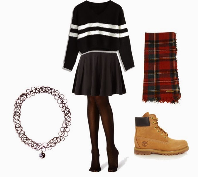
The costume that the people in the images should be wearing should portray the genre of my magazine. This will allow for the reader to be able to tell what the genre is just by the costume that the artist in the image is wearing. 

Women--


Men--


Colour and costumes/props within indie genre


Thursday 20 November 2014

Behind the Scenes- photoshoot


This image shows how that different poses are used within one photo shoot. This will help me when I am taking my images for my magazine as I will know to change the pose of the subjects in my images. This will help to create diversity within the images that I will show in my magazine. 


This just gives an insight into what happens at a photo shoot. They are taking the pictures whilst looking at them at the same time to make sure that they got the image that they had wanted. They also do this to check if the images are visible, meaning that the subject isn't blurred. 


This image shows the different costumes worn at one photo shoot. This shows me that the artists wear clothing that is relevant to their genre, and also they wear a variety of clothing throughout the photo shoot. When I take the images for my magazine, I will make sure that the subjects in my images have clothing related to my genre, and I will also make sure that they have a variety of clothing and props within the images. 

Monday 17 November 2014

Image analysis

Cover page


This cover image is a conventional medium close up shot of one artist on a white background. This allows for the artist to stand out and also, putting the main image over the masthead allows for the image to stand out as well. There is a lot of use of special effects makeup on here, which show his skin flaking away to reveal robotic insides. This shows connotations to the main feature story which talks about how the band 'won't be killed' as he is a robot, and cannot die. The colour schemes are white and red which the main image sticks with as he has red coming out of the edges of his skin. Making this a medium close up shows that he is the most important part of his band, or can even show that he is the whole band on his own. On the right side of the image there is plenty room for other feature stories, but they haven't included any which shows that this one is of top interest. 


This cover image is also a conventional medium close up shot of the artist, however this image has been edited to be in black and white rather than in colour. The black and white colour can show remembrance of this late artist. This allows the text to be a different colour and to stand out against the cover image. They have used a yellow text to allow the colours to really stand out, and they have even changed the colour of the masthead to match the colour scheme opposed to its normal red colour. Similar to the image above, there is a lot of space around the subject of the image where they could have feature stories, yet they only have two, a plug, and a skyline. Even though they have added a skyline, they haven't cut out much of his head as they have tried to put the text above his head and hair. 


The shot used in this cover image is a medium shot. The subject is dressed in black jumpsuit, which reveals a lot of her skin, which can show off her sex appeal. She is in a certain position with her hands over her head, which can also have connotations to her sex appeal and can show how she is now grown up, which can link to the main feature story named 'Miley 2.0'. The costume that she is wearing is a very low v neck body suit which shows off her skin. This costume may appeal to women as they might see the way that she is dressed and how she looks, and might want to look like her. Men might also be attracted to this magazine because of the way she is holding herself, and how much skin she is showing off. The background is a light green, which allows the artist to stand out against it. The main feature story is written across her body in white spaced out font, which stands out against the green background and the black of her costume. The colour scheme is black, white, and green and the other feature stories are in black font which go along with the main image and the colour scheme. 


The shot use in this cover is high angled. They may have done this so that all of the members of the band could fit into the frame. The high angle makes them appear smaller than they are, which could be used to show off the fact that they are a new band. They are all wearing similar costumes: all wearing black and gold shirts, black jeans, and black shoes. This might have been chosen to be worn as they are all a group and the same clothing shows this. Even though this picture was taken at a high angle, all of the subjects in the picture are looking at the camera as if they are addressing the reader themselves. The facial expressions that they are pulling are more laid back, which can portray what type of a band they are to the audience. This will attract people who are in lower social classes as they will be looking to read articles which are a bit more laid back compared to the ones that are made for a higher social class. 

The photo used in this picture is a conventional mid shot. All of the members of the band are visible, yet the female appears larger than the rest of the band. This may have been done to show that she is the main part of the band, so they have made her appear larger by standing closer to the camera to portray this. All of the people in the image are wearing black (maybe to show that they are of the rock genre), including the female, yet her hair makes her stand out, which can also portray the reader that she is a big part of the band. Her hands are up in a fashion that makes it look as if she is directing the other band members, which helps to show that she is the leader of the band. All of the members are staring at the camera, addressing the audience, yet the female is staring very intently at the camera. This can give off the feeling that she is 'leading' you to buy this magazine. The magazine might have even chosen to put the female at the front of the other members (males) as they thought it might catch the readers attention more. 


From these images used in music magazine covers, I am thinking about mostly using a medium close up or a medium shots for the main cover image. Most of the images used in the above covers use these shot types as it is conventional. I will also make sure that the subjects in my images are looking at the camera, so it looks as if they are addressing the reader. Most of the artists that are in the cover images are dressed to fit their genre, so I will take this into consideration when I am producing my images. 


Contents page


This is a contents page from Q magazine. In this contents page, they use four pictures. There is a larger image which is a close up shot of an artist. The fact that this picture is larger shows that this is related to the main feature story, and the close up shot also shows this. The two smaller images below it are most likely related to other feature stories. You can see what page all of them are on by a large red square that includes the page number. There is another image in the left hand corner which related to another article within the magazine, yet as it is in the column on the left, it can be said that it maybe isn't another feature story. 


This is a contents page, again from Q magazine, yet this contents page spans over two pages. This contents page includes a total of 10 images. Some of the pictures aren't completely visible as they are slightly rotated so that the edges of the picture aren't in the page. There is an image on the left page which most likely relates to the main feature story as the image is larger than the others. There is also larger text next to the larger image. 


This contents page is different from the others. This contents page include one image which takes up the whole page. This is good because this can very easily be known by the reader that the main feature story is about that artist, however this is unconventional. As there is only one image on the page, it makes it seem like there isn't much else within this magazine other than the article on the one artist. There is text written on the right side, yet there isn't that much text anyways. The costume used in this image represents the pop genre as she is wearing red and bright colours which stand out. The costume is also related to the prop (mushroom) that she is holding. The short skirt may appeal to the audience as they might be younger, and may want to dress in a similar way to her. 

Double Page Spread


In this double page spread there is one main image which takes over one whole page. The image is a medium shot. Normally these shots don't have parts of their body or hair sticking outside of the frame, but in this photo some of her hair, and her body is cut out. In this photo, they have chosen the subject to be naked, wearing only chain necklaces yet they have chosen her to have her hands over her breasts. This shows that she is being provocative, yet the fact that she is covering herself shows that she is still refined. This may attract a male audience as they might find the way she is dressed sexy, and would want to buy the magazine to see the images. This also attracts a higher social class audience as the images used are in black and white, and there aren't many colours in the picture or the double page spread. We can see this because the artist (Lady Gaga) is a pop artist and is known for her crazy costumes, yet in this one she isn't dressed in such a way. She is in neutral colours, and such so she can appeal to this higher social class audience.


This double page spread is a medium shot image, which spans over the two pages. The costume that is worn in this image portrays the genre of the artist: pop. This can be seen by animal print costume she is wearing, and bright colours of jewellery she is wearing. These bright colours connotate to the genre as the genre is normally up beat, happy, and bright. She is holding her hand up in a way that shows off the ring that she is wearing which states 'icon' which can mean that she might be trying to portray that she is an icon, or a big pop star. The background of the image is pink, which is also bright and happy which can have connotations to the pop genre. The costume that she is wearing also helps her to stand out from the background. 


The image used in this double page spread is a very edited image. They have given this photo the 'bokeh lights' effect, and this covers the left part of her face. This gives the image the ability to portray the emotion of sadness through it. Also, the help of her facial expression and the placement of her hands portray the emotion that she is feeling. The placement of her hands looks as if she is 'clawing for life'. This can show the genre of the artist's music as the image is quite dark, and can show that she is of the emo pop, or indie pop which is the artists real genre. As the image doesn't have many bright colours, this can be said to be for a higher social class audience as there is more to the article than just the picture. This is also supported by the way the double page spread only has one image which is on one page. 

Final Colour Scheme


I enjoy these colour schemes for my magazine, as all of the schemes include black and white in them. This will allow for me to use these colours as the text, which will help the reader be able to understand and clearly read what is on the magazine. These colours relate to the genre as they are plain colours, and the lighter pastel yellows will go well with the genre as it promotes the light free spirited mood of the music. This colour scheme goes well with my target audience (young adults) as they will want a mixture of bright colours, and blacks and whites so they will be able to read the text. This colour scheme will intrigue my target audience as they will be able to read the text properly, and there will still be an aspect of colour which will pop out and catch their interest.


Wednesday 12 November 2014

Makeup and Hair


This mood board shows the hair and makeup which is normally shown with the indie genre, and artists in the indie genre. I have mostly included females because I talked about makeup. I have included two pictures of haircuts for males as I might have a male in my cover as an artist. This mood board will help me style my subjects in my cover and double page spread pictures as I will know what type of hair and makeup is used in the indie genre. This will make it look more tailored to the genre. 

Demographics

Demographics are measurable characteristics of media consumers such as age, gender, race, education and income level. They are characteristics and statistical information that distinguish a group of people. These characteristics commonly include age, gender, ethnicity, occupation, interests, and other quantifiable criteria. A business’ target demographic captures the group of people at which their products or services are aimed. By looking at these characteristics of an audience, it helps us understand how to target a product and helps to differentiate how to appeal directly to an audience.

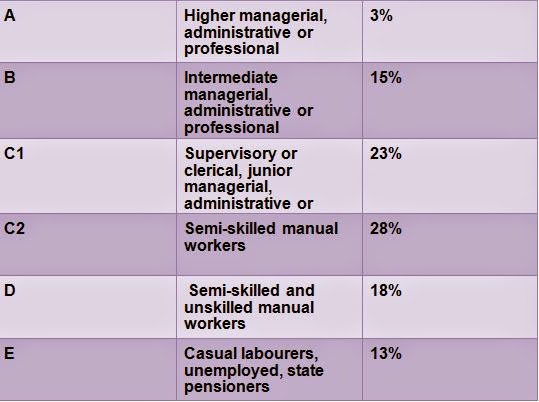
My magazine is aimed at the C2 to E groups. This means that my magazine is aimed at the lower social classes including skilled manual workers to unemployed people and students. I have chosen this social class because the genre of my magazine is more well known within this social class. The indie genre is more well known amongst teenagers and young adults, which are mostly students. Because of this, the money that they will have to spend on a magazine will be lowered as they have other things to pay for such as accommodation, food, and tuition. This helps me decide the price as I know it has to be low enough that they would feel it would be suitable for them to purchase, and still allowing me to get income. The price that would be ideal for this social class would be £2.50.

As the social class that my magazine is aimed at is mostly students and manual workers, I will have to include things which are relevant to them and their needs. This class range will probably look for an even mixture of articles and pictures. They will probably want larger words to stand out to catch their interest. This would mean for my articles I could pick words to make larger and bolder to stand out, and I could also use taboo language that is relevant to my age group. I would also include competitions where they could win tickets to meet a certain concert after their concert. This would be good to have as this social class might not have the money to buy those tickets themselves.
For this class group, I could include things such as free iTunes downloads or vouchers, which would be helpful to this class as they might not have enough money to buy them outright. Other free gifts or prizes that they might be interested in would be a downloadable exclusive interview with a band, or some free sweets.

The social class group table will help me with my feature stories and my target audience. Since the social class group that I am aiming my magazine at has an age range from around teenager to young adult, I should include things that would be interesting to them. This I can find out from asking questions in my focus group which will let me know what people in my target audience enjoy. This might be certain artists, clothing brands, or products which I could include articles or reviews about.


Name Ideas

Name Ideas

For the name of my magazine, I will need a short and snappy word that will be easy for people to remember. This will allow for my magazine to be recognised easily. Since my magazine is a music magazine, I should choose a name that would be music related. I am going to choose a sound word, or an onomatopoeia as this will show the reader that this is a music magazine.


Pulse is my first choice for the name of a music magazine. This is because it is a short word that would easily catch the readers attention, and would allow them to remember the name of my magazine easier. The word pulse has a definition which means "a single vibration or a short burst of sound". This would be good to use as it has connotations to music. 


Beat is another good choice for a name. Beat has two connotations to music. One definition of beat can be see above, highlighted in red, as meaning to sound as on a drum. This is good because within the indie genre there is a lot of drum use in the music. The other definition of beat within music is the basic unit of time. This keeps all the music in the correct time, and is used within music theory. This would be a good word to use because of the connotations that it has. 


Stroke can mean hitting against something which makes a noise. This could tie into music as you could link it to the sound created when you hit drum sticks against the drum. Stroke could also mean the stroke of playing the guitar strings. Lastly, stroke has links to music artists such as The Strokes. This could be a good name, but because of the close name to The Strokes and that it has other meaning such as petting someone or something, I don't think I will be using this name. 


Crash would be a good name as well. Within a drum kit, there is a crash symbol. This is mostly likely used a lot within the indie rock genre. Crash can also mean 'to make a loud clattering noise' which is something that can be made when you are playing instruments. This would be a good word because it is short and snappy, and would catch the readers attention if the logo was made to look shattered, such as Kerrang's logo. 


Clash is a very similar word to crash, and has a similar meaning as well. Clash means 'to make a loud, harsh noise'. This can be seen within music, as sometimes when they bang together the drums, and they let the guitar chord ring out, it can be a loud harsh noise. However, I would want the name of my magazine to have good connotations, and the meaning of being a harsh noise might not be well for my magazine. 


Audience Research Focus Group and Review

I have carried out a focus group asking questions about audience, and other questions about genre of music and so on. This has helped me learn what type of artists that I should include within my magazine, as they are the ones that most of my audience group listen to. I have also asked other various questions which will help me tailor my magazine to the audience. This will allow me to improve the sales of my magazine.


1: How often do you buy music magazines? 
The response I received from the focus group said that they buy music magazines monthly, or every so often. This leads me to know that I should put out my magazine monthly, as I would have a larger chance of someone buying my product.
2: If so, what magazines do you buy, and why?
Most of the people in the focus group said that they buy Q magazine or NME, and that they bought this because of the artists included within them. The artists included within those magazines tailors to their taste in music, therefore they purchased it because it included artists that they knew and wanted to read/learn about.
3: What would be the ideal price range for a music magazine and why?
My focus group told me that the price range that would be perfect for them would be from around £2 to £3. They said that they were most likely not going to buy a magazine that was over this price as they would not have enough money to splurge on a magazine which is over £3. They also told me that if the magazine was a special one, such as Q or something that had a special item inside, that they would consider buying it for more than £3.
4: What genre of music do you listen to the most and why?
From my focus group, I gathered that R&B and indie rock were the two most listened to genres. This shows me that I should maybe include artists from other genres besides the indie genre that I am basing my magazine around. I could include a little box on my contents page saying something like "In Other Genres..". This would allow readers to know about other artists which they might enjoy but aren't directly included into the genre of my music magazine.
5: How often do you listen to the indie genre?
The indie genre was listened to quite a lot within my focus group. This lets me know that the indie genre is well known of, and listened to. This will help me with the sale of my magazine, because it means that the artists included in my magazine will be known of, which will intrigue readers.
6: What 3 artists would you associate the genre 'indie' with?
The focus group gave me insight to what they thought what artists were included in the indie genre. They said artists such as The Courteneers, The 1975 and The Kooks. These could possibly be artists that I could include within my magazine.
7: Are you more likely to purchase a magazine if it had a free offer included, such as free sweets or a free album download?
My focus group all gave me a clear answer: YES. They said that they are more likely to buy a magazine which includes something free as it gives them an incentive to buy the magazine more if they are receiving something such as sweets or an album download code.


Overall, I have learned some really good information that will help me in making my final product. I have decided to keep the genre of my music magazine as indie because I have found from my focus group that my target audience knows quite a lot about the indie genre. This is evident as they were able to name some artists from the genre such as The 1975 and The Kooks. I also found out that the ideal price range for my magazine would be around £2.50. This is because the people in my focus group were all students, and they had the ability to purchase magazines only when they have extra money available. Most of the people in my focus group told me that they liked to read Q magazine, which has more articles than pictures of bands. This shows me that my target audience, since they are older teenagers to young adults, they like reading about the artists a little bit more than just seeing the photos of them. One main point that I have learned from my focus group is that they would really like to have a free offer included within the magazine. This could be anything from sweets to an album download. This lets me know that I should really include a plug, and have a free offer, as this would improve the sales for my magazine within the target audience that it is aimed at. 

Monday 10 November 2014

Audience Research Questions

Why is audience research important and how will it help you when creating your magazine?

1: Audience research will help me when creating my magazine because I will then be able to know what type of music that they listen to and what products that they enjoy. This will help me with creating my magazine because then I will be able to write articles about those artists and put in advertisements they want to see in which will help boost sales as more people will relate to the magazine. 

2: Audience research will also help me know what price I should have my magazine at. I will need to know what price it should be because that will help me increase sales depending on the focus group that my magazine is aimed at. If the price range is relevant to my focus group, I will have more sales on my magazine. An example of this would be asking a university/college student how much money they would want to pay on a magazine.


Questions to ask: 

1: How often do you buy a music magazine? (eg weekly, monthly, yearly, never)
2: If so, what music magazines do you buy, and why do you buy them?
3: What would be the ideal price range for a music magazine and why?
4: What genre of music do you listen to the most and why?
5: How often do you listen to the indie genre?
6: What 3 artists would you associate the genre 'indie' with? 
7: Are you more likely to purchase a magazine if it had a free offer included, such as free sweets or free album download?