Tuesday, 9 December 2014

Making my first draft


Adding the masthead

First I had to make sure to get rid of the white in the background of the masthead before putting it onto my image. This is because I downloaded a font onto Word, write the masthead, and then screen shot it. 

Once I had finished making the background of my masthead transparent, I added it into my main cover image by dragging it over. 

Adding a rectangle

First I added a rectangle using the rectangle tool. This made a plain coloured box (you can change the colour of it) which I could move around the image. 

Then I changed the opacity of the rectangle. This allowed for you to slightly see the image through the rectangle so you don't have a really strong difference between the main image and the rectangle. 


Monday, 8 December 2014

My Own Props

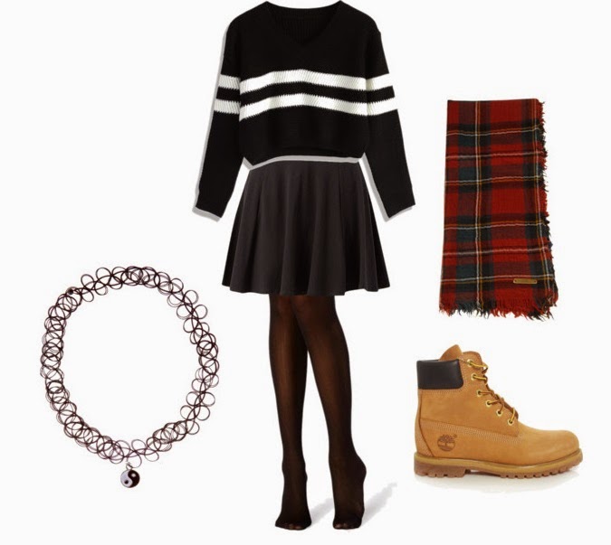
Some of the props I might use in my main image shoot are ones that I currently own. These props and clothing of mine are ones that suit the genre of my magazine. They are ones that I am considering using in my photo shoot.


Monday, 1 December 2014

Changing hair colour in photoshop


This tutorial in how to change hair colour will be useful in my product as I intend to add some colour into the hair of one of the artists in my main cover image. 

Process:


Before and after:

Designing my masthead


Thursday, 27 November 2014

Test Shots

medium shot-

badly framed medium shot-
This image is badly framed as part of her head is cut off from the image. Even though you can still see the majority of her face, this wouldn't look nice on a magazine cover as there would be no room for a skyline as her forehead is coving it. This also doesn't look nice as it looks as if she doesn't have a full head. 

medium long shot-

badly lighted-
This image is badly lighted. This is because the only light in the image is coming from the left side of her face. This leads to her face being only half lighted, leaving a darker side of her face. This doesn't look professional or conventional. 


close up-

medium two shot-

medium long two shot-

long shot-

medium shot-

props-
Normally props are used within images in a magazine. Obviously these props do not go well together as they are two different styles, but in my magazine images I will be using props that go along with the genre of the magazine. The props will help the reader identify what genre the magazine is so they will know if they are interested in the content. 

badly framed-


These two pictures are badly framed. In the first image, you can see too much of the area around the subject which does not look good to be on a front cover of a magazine. The second image has cut off much of the persons face which will not look well when you are trying to have a direct mode of address on the cover image of a magazine.

Monday, 24 November 2014

Costumes for Models

The costume that the people in the images should be wearing should portray the genre of my magazine. This will allow for the reader to be able to tell what the genre is just by the costume that the artist in the image is wearing. 

Women--


Men--


Colour and costumes/props within indie genre